Case Study
Scholarful
By 2020, the student-debt bubble has become a trillion-dollar crisis, and with no end in sight, entire generations of America’s youth are embarking on adulthood with financial shackles around their ankles. Scholarful was created to empower students who want to take control of financial future and pursue a college education.
Contribution
Branding, Research, Strategy, UX/UI Design, Prototyping, Visual Design, Front-end coding
Role
Product Design Lead and Product Manager
Tools
Sketch, InVision, InVision Studio, Wordpress
Team
Product Design Lead + QBS Learning for Development
Overview
Searching and applying for scholarships individually can be a time-consuming and frustrating process involving research, writing essays and personal statements, providing financial documents and more. After experiencing the frustration of applying to scholarships, University of Pennsylvania student Rhea Saggi was inspired to create a platform for students to create their profile, provide their documents and search for applicable scholarships all in one place. On the other side of the equation, scholarship providers could create and list their scholarships and create a larger reach of applicants.
The Challenge
The product would be require supporting two user types with different goals: students applying to scholarships who could access their applications, essays and documents in one place, and scholarship providers to list, create and manage their scholarships including the ability to select award winners and appeal to the aethestic of both user types.
Mobile first approach was crucial for the student user demographic and a smart UI to keep all user types engaged through several application steps and forms. It was important to match up the possible scholarship provider requirements with information captured from the student, and to time requests for further information appropriately to avoid overwhelming the user.
July 2020 - Present
The Plan
A startup company requires one to wear many hats and in this case, adhere to budget / time constraints as well. As the product designer and project manager, I collaborated directly with stakeholders and engineers and established the most realistic minimum timeline to get to MVP and the process going forward for the project.
After defining our users, the first step was in-depth research of competitors in the market, similar business models, subscription plan models and websites targeted to our demographics, particularly in the context of education.
week 1 - 2
Conduct research and analyze gathered insights with team
week 3 - 4
Create wireframes for both user flows, review with team
week 6 - 9
UX / Visual design
week 10
Application development and simultaneous Wordpress website development
Getting to work
Research insights were shared and analyzed with the stakeholders and team and the minimum information needed to be captured were outlined. I would have liked to take this time to do some user flows, but time constraints did not permit this and we went directly into wireframes.
I used InVision Studio for integration with InVision to create the wireframes in order to create prototypes to map every interaction in order to compensate for skipping the user flows. For me, wireframing is quicker using graphic tools such as Sketch. I'm not much of an illustrator and drawing it out doesn't allow me to focus as well as I can using tools I'm proficient in.
During a 3-week period we examined each “screen” for both the student and the scholarship provider side, grouping all the types of relevant information.
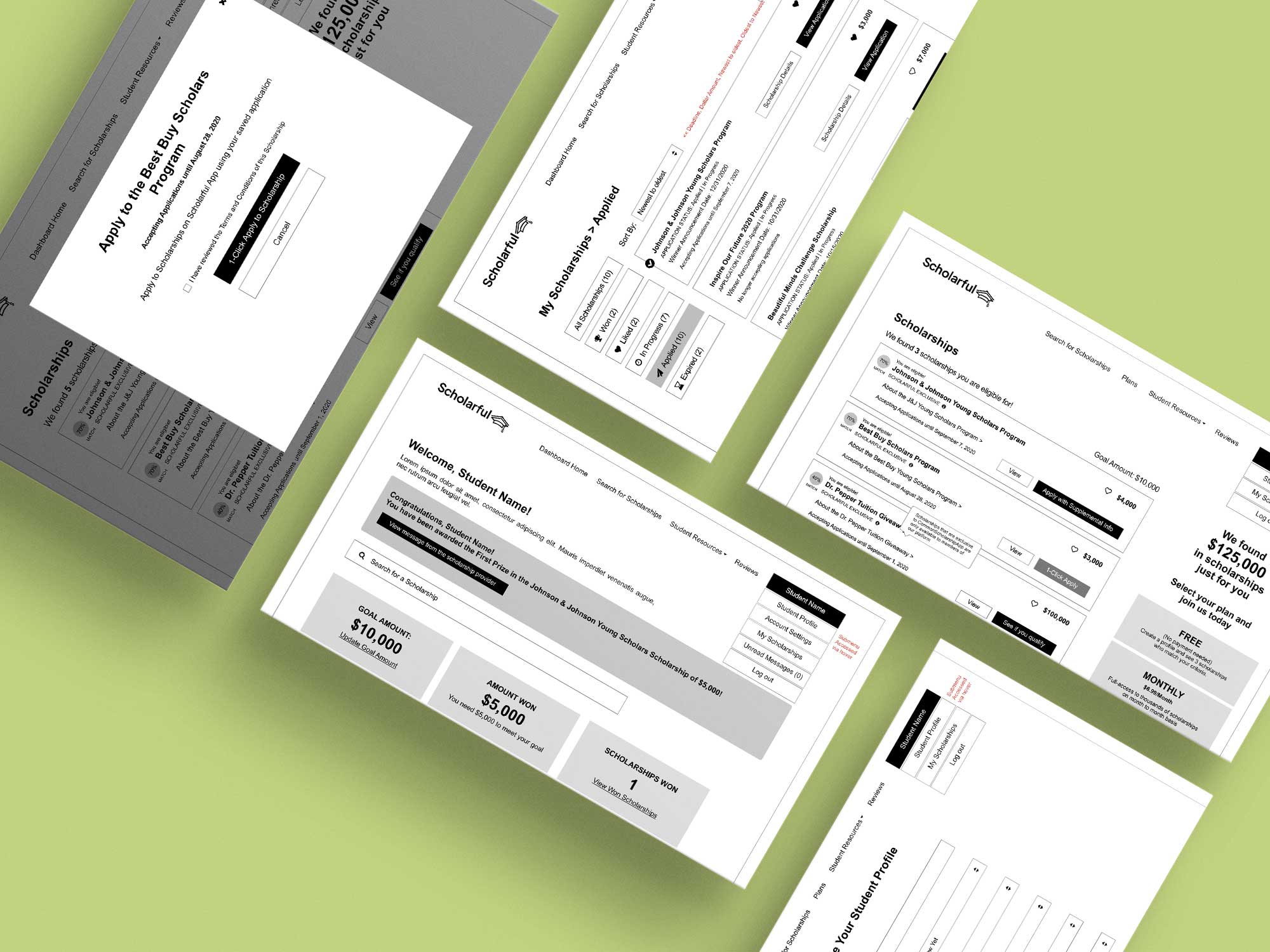
Student User Wireframes
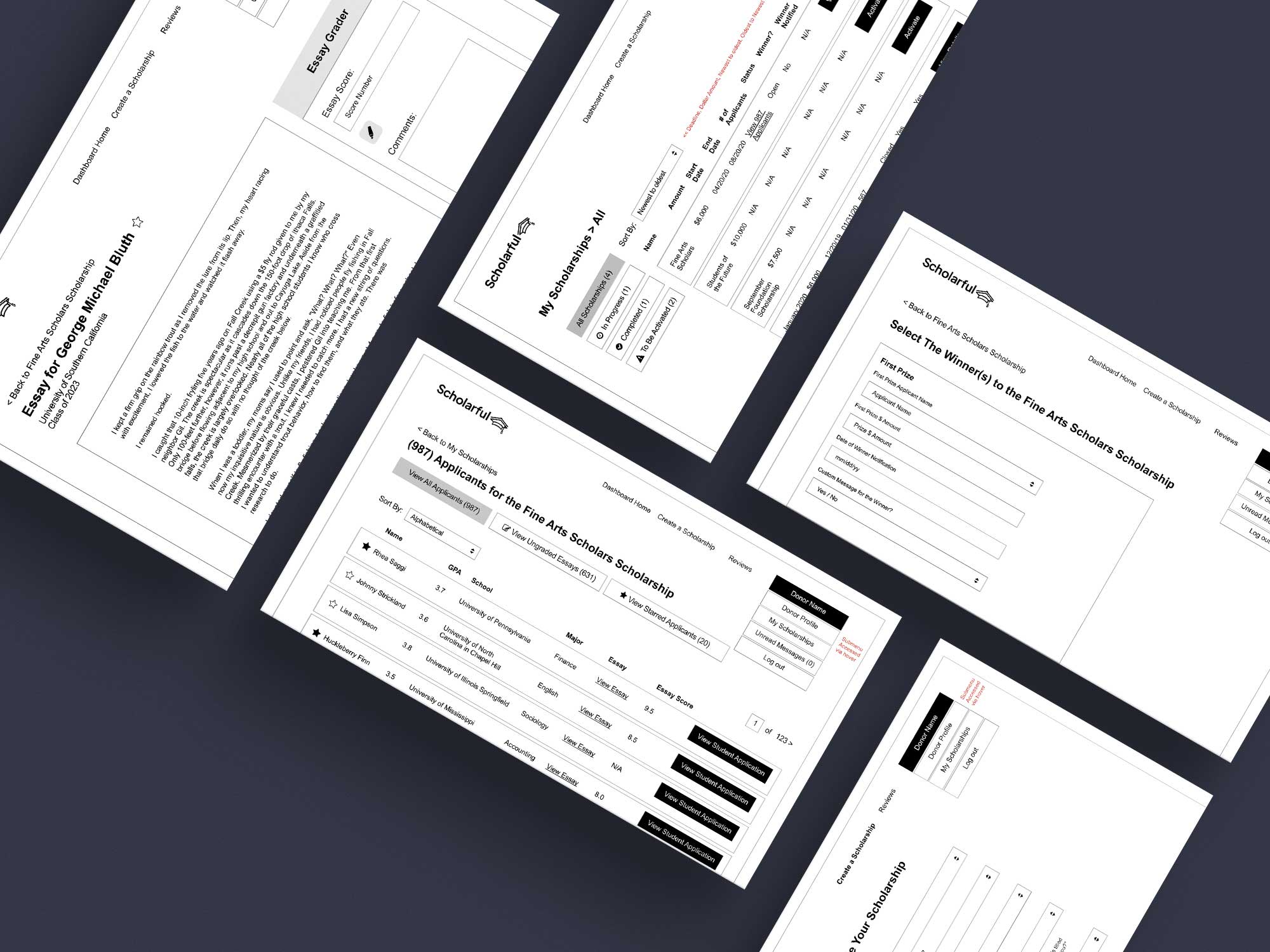
Scholarship Provider User Wireframes
Visuals
Armed now with the research and inspiration from various sources targeting our demographic, I attempted to keep the aesthetic clean and readable but easy to use and modern for our computer savvy main target demographic, the student, who primarily uses a mobile device.
The 3 week design sprint primarily focused on the student journey for both mobile and desktop for MVP with the assumption that the scholarship provider flow had already been wireframed and the styles would be consistent.
Development
On the product development side I was the only one driving the UI, UX and all visuals. I found it crucial to have daily meetings with our development team located in India to discuss the project with an experienced team familiar with building these types of platforms.
We reviewed designs for UI and functionality, addressing all questions and discussing any potential gaps that might require a second look or further mockups. The student portal was launched in July, 2021, swiftly followed by the scholarship provider portal a month later.
While our development team was busy building out the application, I designed next phase features and built the consumer-facing website and blog using Wordpress.