Case Study
Speki
The training service members get in the military and the skills they specialize in are not always what employers are looking for in the civilian world, and this is especially a challenge for service members who joined the service from high school or at a young age.
Qualities like: problem solving, leadership, ethics, and time management may be part of the veteran’s skill set, and this is where Speki comes in to match skills with jobs and training for careers.
Contribution
Branding, Research, Strategy, UX/UI Design, Prototyping, Visual Design, Front-end coding
Role
Product Design Lead and Product Manager
Tools
Sketch, InVision, InVision Studio, Wordpress
Team
Product Design Lead + Carlisle Lustenberger + QBS Learning for Development
Overview
Speki, which means wisdom in Nordic, was originally concepted to be a corporate hiring tool for corporations looking for candidates that have the skills they are seeking for their open positions. Speki would partner with corporations to design courses based on the skills desired by the company for their employees.
But what would make Speki stand out from similar business models or competitors? Enter career veteran and Navy Commander, Carlisle Lustenberger who would guide the business model to target returning veterans re-entering the workforce and would require training to enhance skills learned in the military.
The Challenge
The product visually would require appealing to at least two types of users: the veterans and corporations, and each would require their own dashboard with completely different options. Eventually we would also require an administrative view for Career Advisors, which would be a feature of the platform.
We would need an algorithm that would match user's military rank code with skills but needed to allow the user to indicate their interest in each skill. In addition, we needed to allow users to enter skills not captured and then match all the skills to real-time job openings.
July 2020 - Present
The Plan
It took a few weeks of discussions, but once the demographic changed to focus on veterans as a primary user, we moved forward with the Student Journey.
While I started research on the process of registering for an online course, the development team at QBS Learning in India started researching APIs for the military rank and skills algorithm and the job feed requirement. As a creator of online courses, QBS Learning also started planning the LMS for the users who register for courses.
We started focusing on the Student Journey from the website through the sign up and profile creation process. After that we circled back to the corporate portal, where corporations can create open job postings and manage job candidates.
week 1 - 4
Branding, Conduct research and analyze gathered insights with team
week 5 - 6
Create wireframes for the student user flows, review with team followed by review with QBS Learning, the development team.
week 7 - 9
UX / Visual design
week 10 - 11
Wordpress website development of the consumer-facing website and start design of student portal
week 12 - 16
Student portal design finalization and review and handoff with QBS Learning for development. After handoff, jumping into the corporate portal. Repeat process used for the student journey.
Getting to work
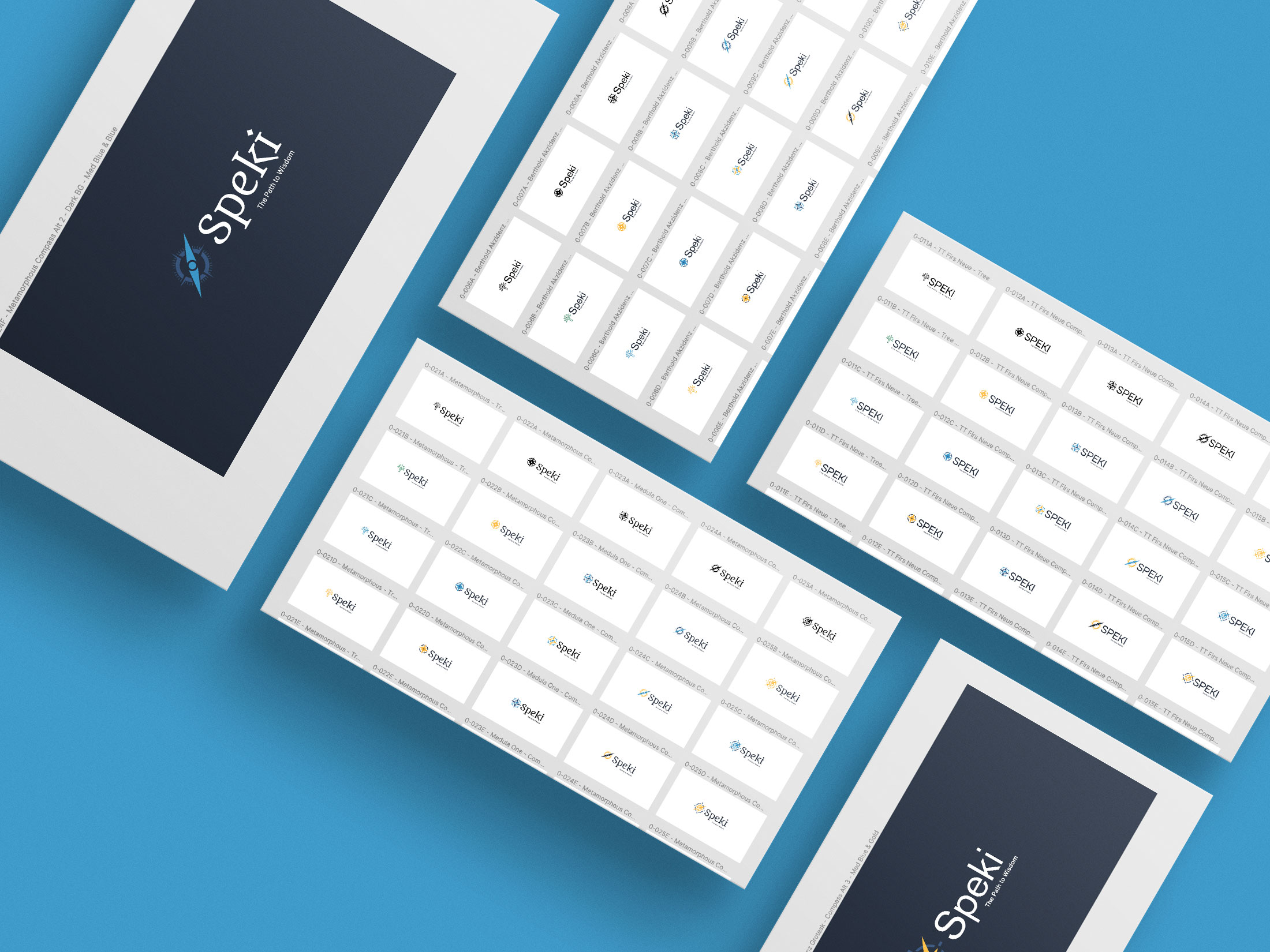
First requirement was creating the brand, which took longer than I had hoped and plenty of variations of theme to tie into the journey theme. I presented all variations in colors from our palette and really leaned into the exploration to find agreement with all parties. The project had many upper-level stakeholders contributing to the overall look of the visuals, so it was important to hit the right note.
Research on the application was my next step after locking down the visual theme and launching the website on Wordpress. While I was (plenty!) familiar on the process of searching for and applying for a job, I had never gone through with the purchase of an online course and needed to study that process.
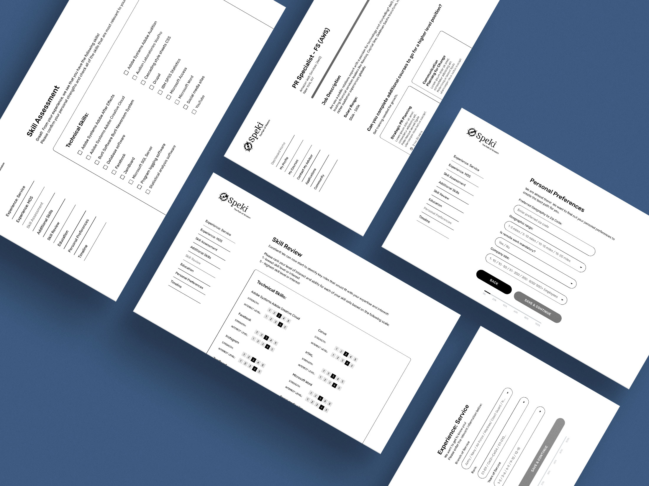
I started with wireframes to outline the profile creation proces, working closely with Carlisle to capture all the features that would differentiate the product from other job sites and real job openings with the specific skills needed to apply.

Part of the Speki logo exploration

"Student" User Wireframes
Visuals
We chose a conservative color palette and look and feel for the design, to provide a sense of stability and strength. The aesthetic also had to be uplifting and tie in to the journey concept.
While we suspected many of users to be using desktop (laptop) to take courses, maintaining the same functionality on mobile was critical for younger users.

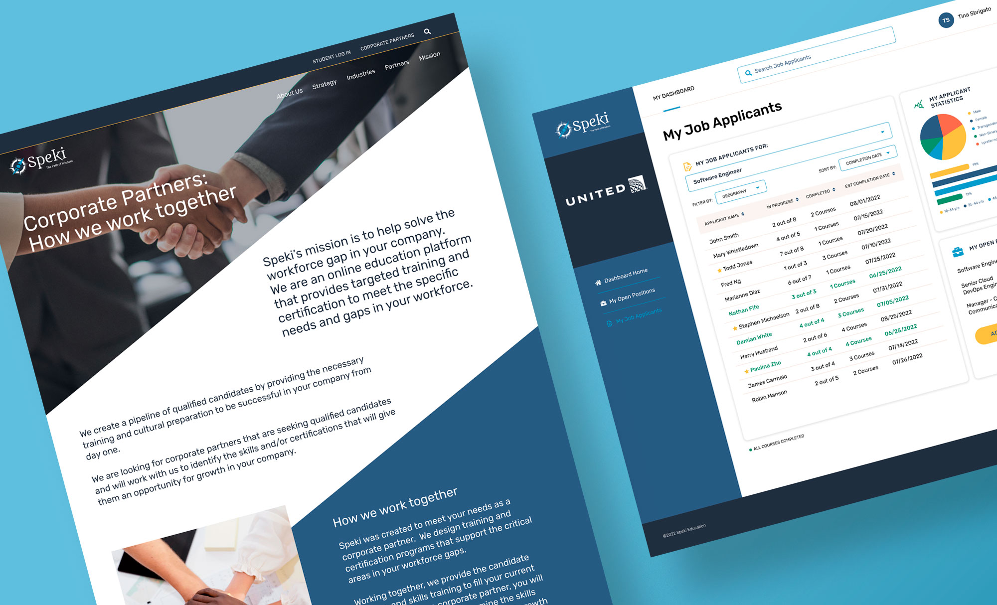
Speki student designs for mobile (top, above) and corporate portal designs for desktop (bottom)

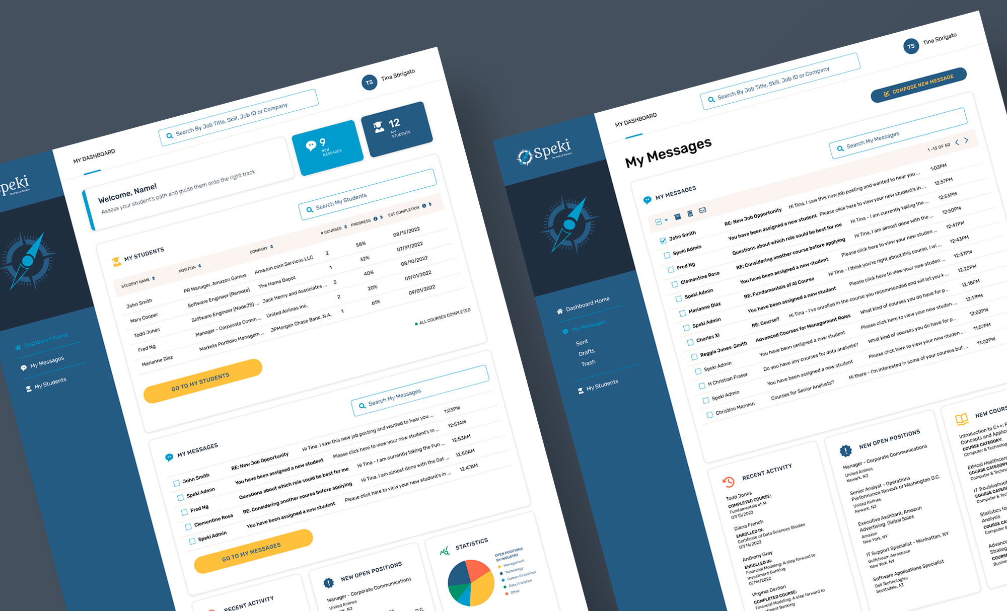
Speki career advisor designs, desktop
Development
QBS Learning did the development on both the student portal and the corporate portal. We had weekly check-ins to find potential gaps and after every new feature release I would do QA to check if everything was working as expected.
While our development team was busy building out those portals, I designed Career Advisor portal, which included a messaging system for advisors and students to communicate within the platform.