Case Study
RillaFi
The RillaFi mission is to take the student debt crisis head on leveraging the power of blockchain and DeFi. RillaFi serves a utility mechanism for higher education and fuels blockchain-enabled scholarships – ultimately helping alleviate the student debt crisis.
Contribution
UX/UI Design, Visual Design, Front-end coding, Project Management
Role
Product Design Lead
Tools
Figma, Wordpress
Team
Product Design Lead + Theodore Zipoy + Aaron Knudtson
Overview
The blockchain ecosystem is rapidly developing. RillaFi allows users to conduct peer-to-peer transactions on digital platforms to support higher education. RillaFi serves a payment mechanism for higher education and fuels blockchain-enabled scholarships ultimately helping alleviate the student debt crisis. This is achieved by creating a decentralized protocol and digital ecosystem that will innovate the way students and universities manage the scholarship procurement and disbursement process. RillaFi infrastructure will ensure scholarships are more plentiful, more accessible, and more equitably dispersed while building an extensive and diverse network of connected and digitally literate students, universities, and enterprise partners.
The first priority was defining the brand, followed by design of the online presence for RillaFi for presention purposes with potential investors and advisors. Following that project was the task of creating an application for the pre-sale of the RillaFi token which would evolve into the next phase of introducing the token to the public.
The Challenge
As the product designer and manager on the project the challenge for myself was learning about cryptocurrency and the market, and the process of investing in crypto (a concept I still have trouble grasping) and how this converts into the design I needed to create. Luckily I had my crypto experts Ted & Aaron to point me in the direction of the competitors or websites they used whose functionality would be required.
October 2021 - Present
The Plan
The product would be introduced and then available for pre-sale for initial investors. Once the pre-sale was concluded, we worked on creating a platform where donations were collected and/or locked before the token would go to market.
Extensive research would be required on my part to understand what crypto investors have grown to expect through this financial transaction. I'm no finance expect under regular circumstances.
week 1 - 2
Conduct research using cryptocurrency marketplaces like CoinMarketCap to analyze this complicated type of financial offering and develop several look and feel design options for the stakeholders
week 3 - 4
Wordpress website development and pre-sale application kickoff
week 6 - 9
Pre-sale application development
week 10 - 14
Donor Dashboard design and development
Getting to work
Initial research enabled me to narrow down visual options to present to the team and we found a design direction for the main website. While the team was preparing the pre-sale application kick-off I was coding and launching Rillafi.com
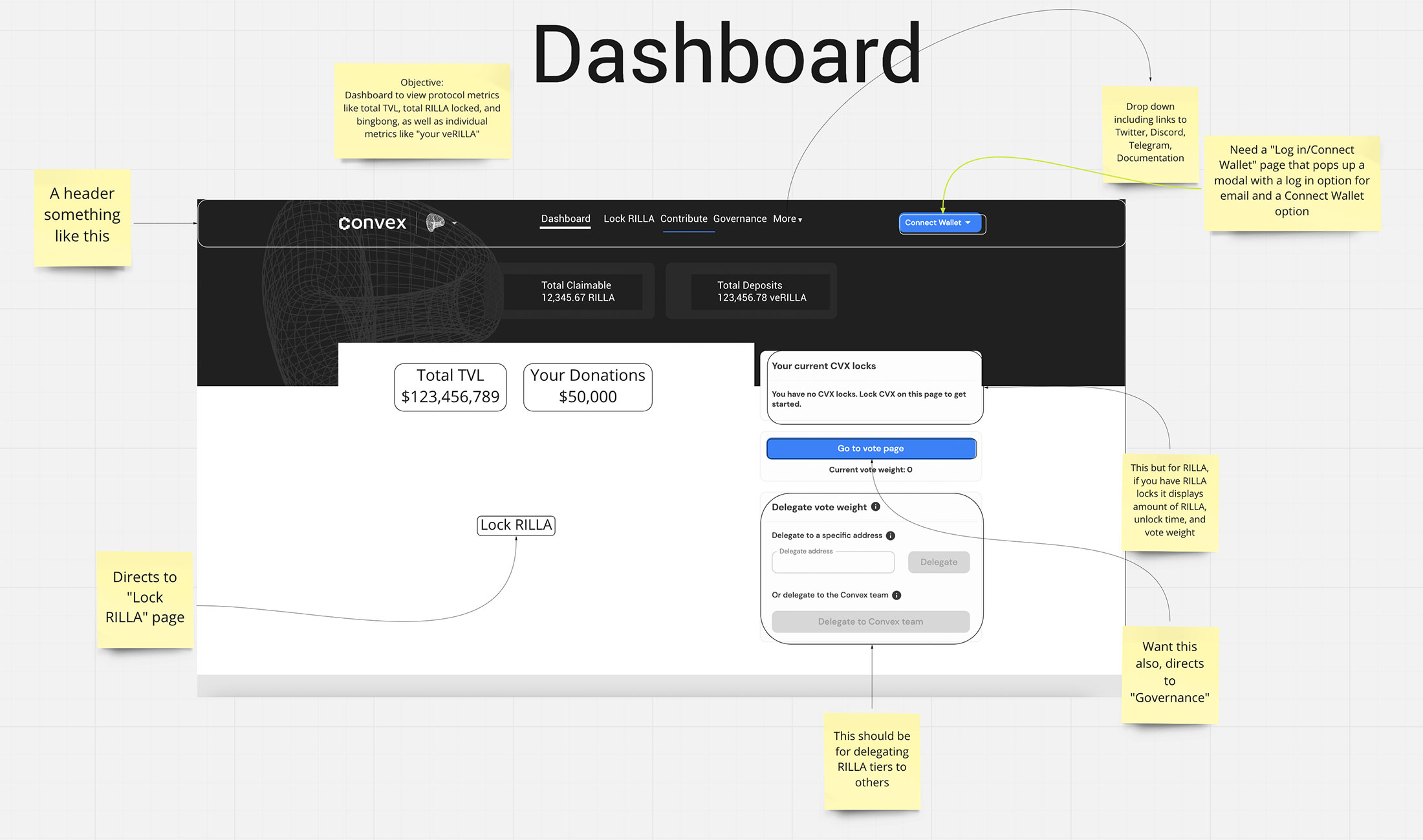
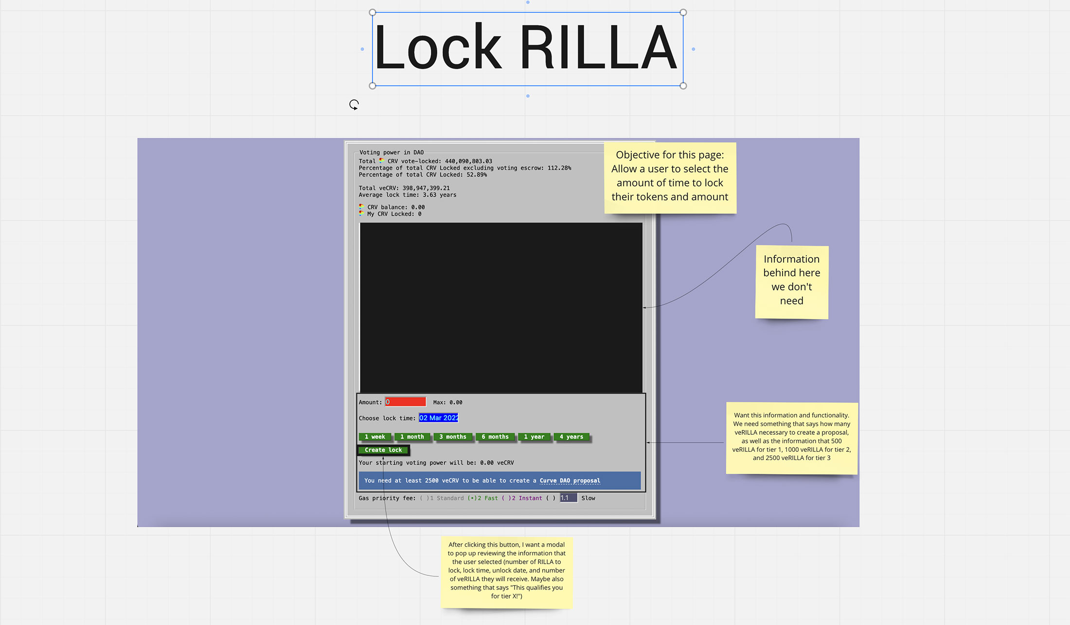
Next up was the pre-sale application: research here was the key to deciphering the screenshots (wireframes) the crypto experts provided via Miro board to communicate what features were required for the pre-sale application and dashboard.
While the screenshots provided the basis of what content was involved, further research would be required to understand the flow for each transaction.

Pre-Sale Application "wireframe" of Dashboard Home screen

Pre-Sale Application "wireframe" of Lock screen

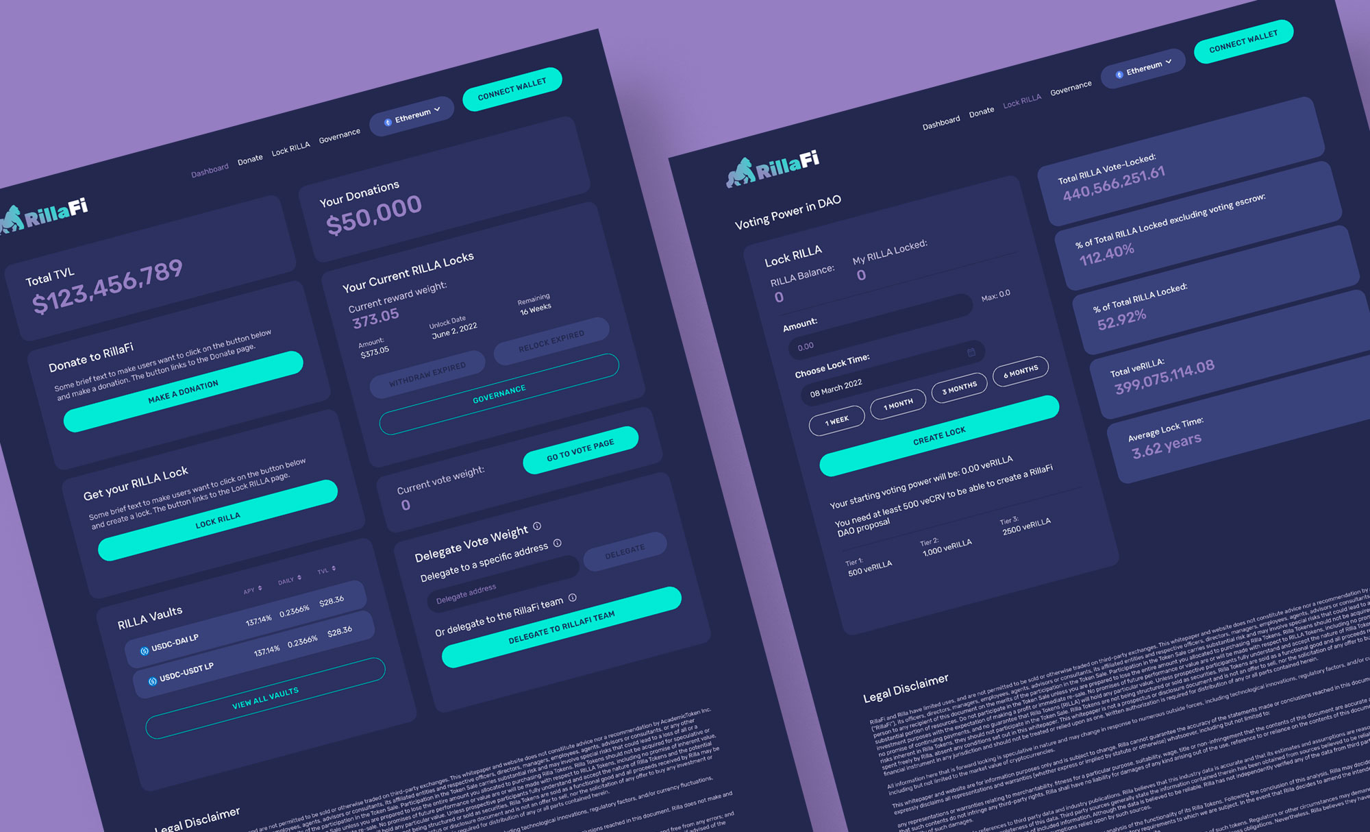
Pre-Sale Application desktop designs
Visuals
We decided on a dark, sleek aesthetic for RillaFi to try to communicate a digital and contemporary product. It was later decided to have RillaFi as part of the Scholarful eco-system, so typography and color palette were adjusted to match both brands and websites.
Aaron Knudtson (crypto expert and software engineer) would be developing the applications and we decided on using Google Material design as the front end framework for the project. Corresponding icons and components were used in the design to expedite development and get to launch within the timeline.
Development
Aaron was driving the development using ReactJS but admittedly his CSS styling skills were not as strong. He shared the code repository with me and here is where I was able to apply my expertise of CSS and contribute to the development.
The project had many starts and stops, but that suited me fine since I was busy with the company’s other offerings (see Scholarful and Speki). The pre-sale application screens were folded into the final product – the Donation Dashboard – which launched mid 2022.